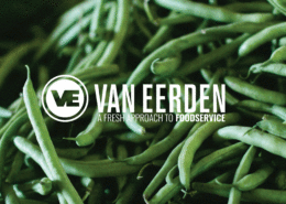
Family owned and operated since 1920, Van Eerden has always looked at situations from their customers’ point of view, serving their restaurant partners well for the past century.
Today, Van Eerden is in the early stages of succession to their 4th generation of leadership. Along with this transition, came the desire to have a company brand as clean and fresh as the produce they’re known for delivering every day.
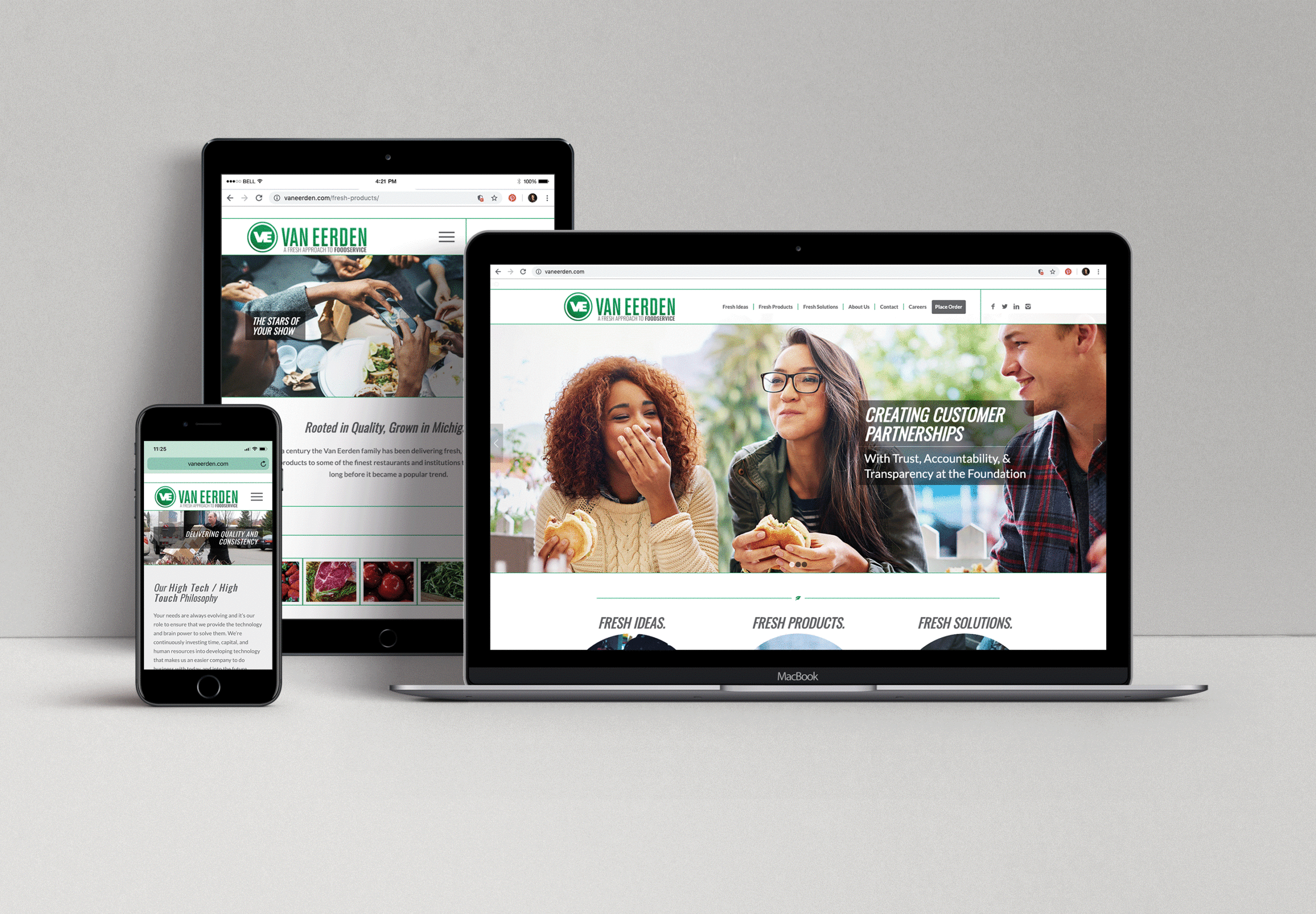
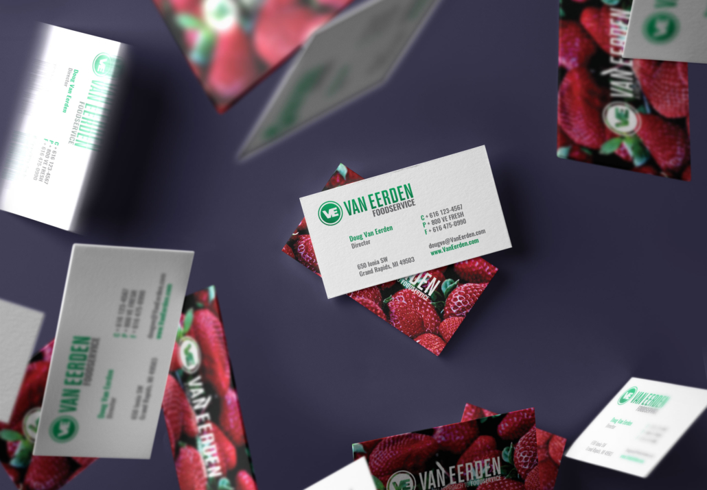
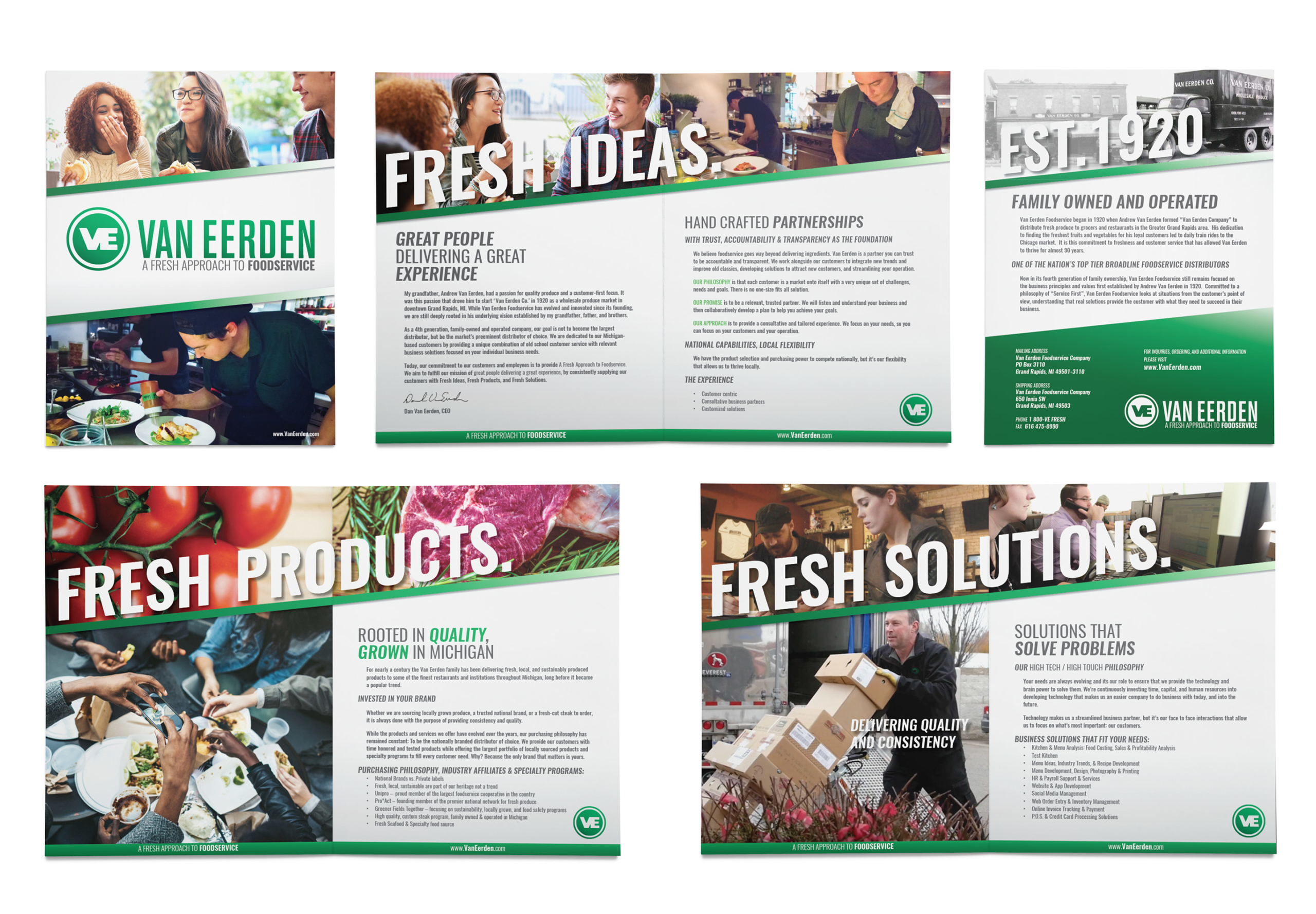
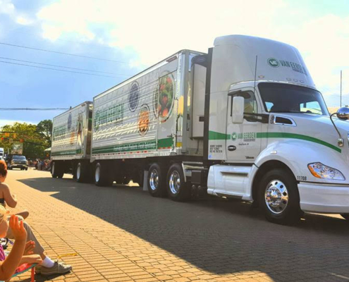
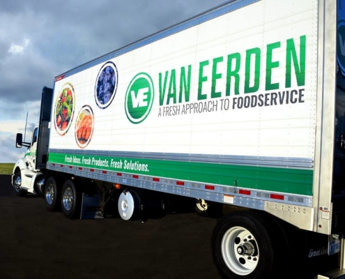
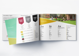
From the outset of our work, we knew that the new Van Eerden brand needed to lean into their “high tech and high touch” philosophy. The brand we developed is very clean and clear, featuring an updated logo that can be utilized as a ‘VE on a plate’ or simply left white and green. Flexibility is key when you’re shipping fresh food products throughout the midwest. With clear typefonts and bold colors, the new truck designs, promotional materials and displays, and inner-office materials speak to who they are, the “fresh approach to foodservice.”
Branding & Logo Development
Brand Guidelines
Branded Marketing Materials
Copywriting
Taglines, Voice, & Messaging
Signage, Environmental, & Tradeshow Design
Web Design & Development
Campaign Creation & Development
Photography Art Direction

